
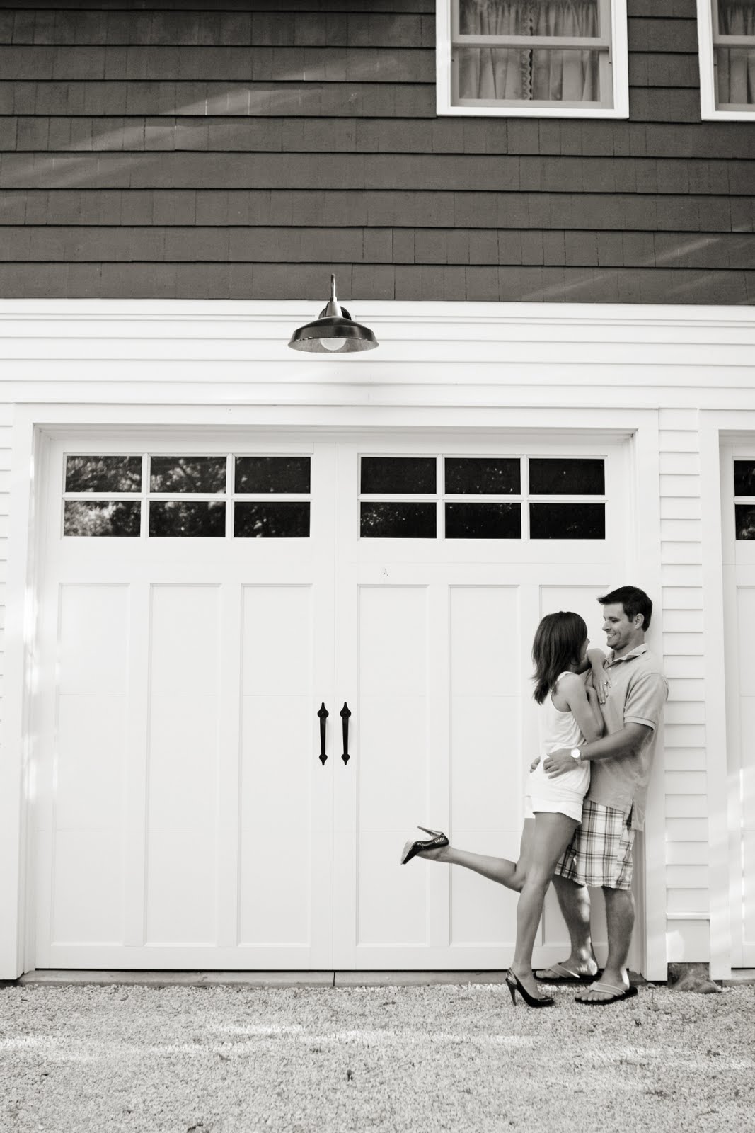
 The invitation was housed in a pocket that also served as an inner envelope. I wrote the first name{s} of the guests on the square on the outside of the pocket/inner envelope.The white outer envelopes were then addressed with a coordinating navy ink to pull everything together.

Below is a glimpse into the inside of the inner pocket where the invitation is mounted on the right and insert cards will be added to the pocket on the left. Loving all of the different typefaces, naturally.
 So there you have it! Isn't it a gorgeous suite? You can never go wrong with navy & white...especially when it's a navy & white pocket invitation!

 As if the outside of the invitation wasn't particularly awesome enough, just wait until you see the inside. Each and every page was personalized. I'm telling you, the amount of detail that was put into this wedding invitation is outstanding.
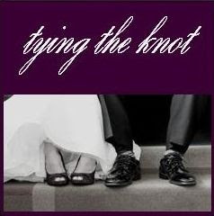
  My favorite page has to be the "Reference Guide...For Tying the Knot,"
  Image credits:
  Half of the back of our card displayed the "thank you" picture we took on our wedding day incorporating our purple monogram. The other half of the card was blank, which is where I wrote our thank you note.
  Read more about the details of our thank you cards {where i ordered from, pricing, etc} on


